The Growing Crisis of Space Debris
A project proposal on orbital congestion and its implications for future space activities
Our Goal
This project will show visitors how space junk has become a big problem above Earth and why it matters for future space missions. Using eye-catching visuals, we'll show how human activities have filled space with clutter that can damage working satellites. Looking at the satcat database, we'll tell the story of how space has changed from an empty frontier to a crowded place that needs better management.
What We Found While Looking at the Data
There's Way More Junk Than Working Satellites:
- Our analysis shows that over 65% of all objects orbiting Earth are just space junk. For every working satellite, there are about 3 pieces of trash floating around up there.
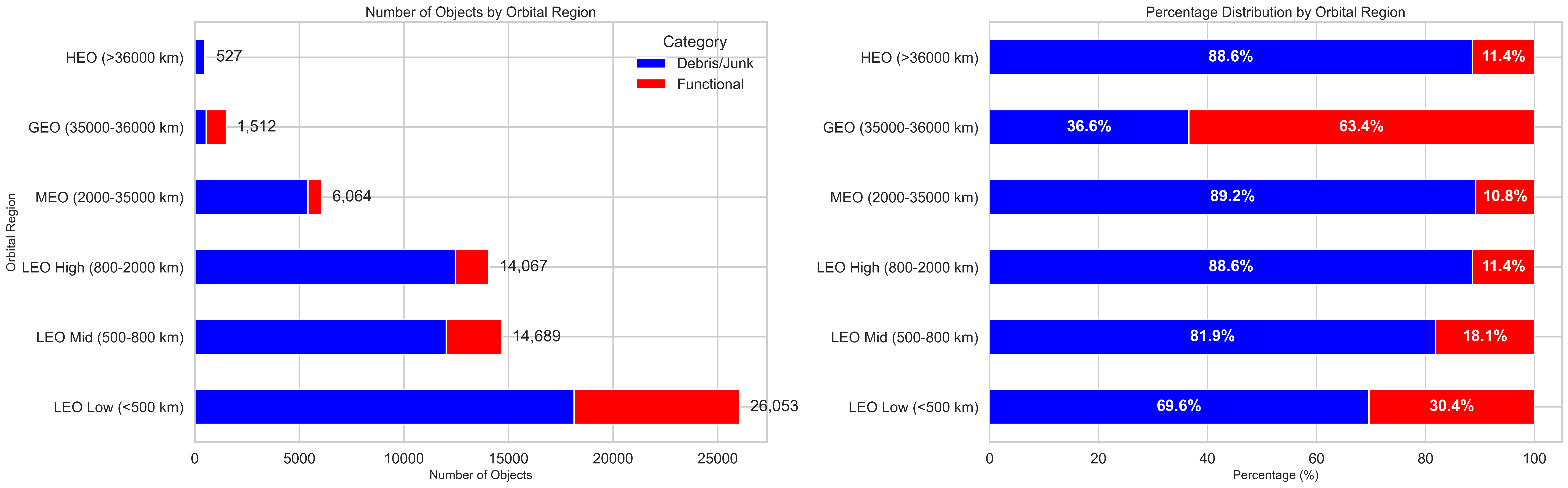
Low Earth Orbit is Getting Very Crowded:
- Our initial analyses clearly shows how crowded different regions of space have become. The lower parts of Earth orbit (LEO) have the most objects overall, with nearly 26,053 objects in LEO Low alone. While LEO Low has the most working satellites (30.4% functional), other regions like LEO High and MEO are almost 90% junk.
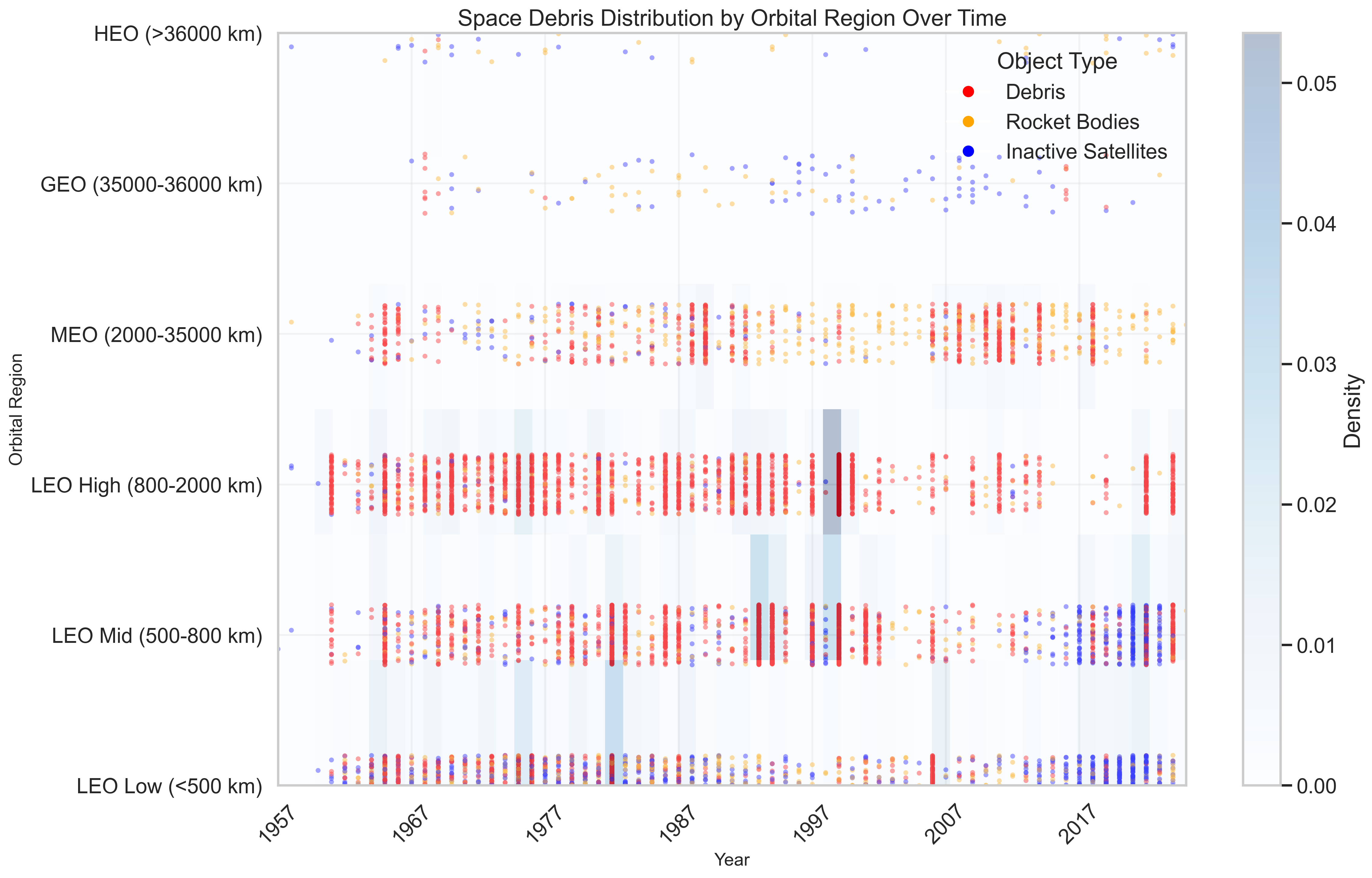
We Can See When Major Junk-Creating Events Happened:
- We also gained insights into how certain events created thousands of new pieces of space junk all at once. The biggest spike in 1999 added over 4,000 pieces of debris in a single event. Other significant events include satellite breakups in 1982 and 1993, and more recently the Chinese anti-satellite test in 2007 and the Iridium-Cosmos satellite collision in 2009.
We Can Track How Junk Has Spread Over Time:
- LEO High (800-2000 km) has dense vertical columns of debris from specific events
- LEO Mid and LEO Low show how space junk has increased dramatically in recent years
- Higher orbits like GEO and HEO have fewer objects but still show concerning debris presence
Our visualizations provides a detailed view of how space junk has spread across different orbital regions since the beginning of the Space Age. Each dot represents a piece of junk, color-coded by type ( red for debris fragments, orange for rocket bodies, blue for dead satellites )
The visualization reveals concerning patterns:

Country/Organization Contributions:
- Some organizations have extremely poor debris-to-satellite ratios
- CASC (China Aerospace Science and Technology Corporation) and KVR have ratios of over 40:1 and 100:1 respectively
- This highlights the varying commitment to space sustainability among spacefaring nations

What We Plan to Create
For the Infographic:
We'll create an eye-catching poster that tells the story of space junk, from the early days of spaceflight to today's crowded orbits. It will use the visualizations we've developed to show where junk is concentrated, which events created the most junk, and why this matters for future space missions.
For the Interactive Dashboard:
We'll build a dashboard where users can explore the space junk problem visually by themselves. They can filter by time periods (see how space got more crowded), by altitude (explore different orbital regions), and by object type (compare working satellites to different kinds of junk).
Tone and Experience
Infographic:
Tone: Fun and informative, mixing cool space facts with eye-catching visuals that make the science approachable for everyone
Experience: A visual journey through space history that feels like flipping through a colorful space storybook, with surprising "did you know?" moments that capture attention
Interactive Dashboard:
Tone: Playful and discovery-based, like a space detective game where users uncover clues about our orbital neighborhood
Experience: A hands-on adventure where users can tap, swipe, and explore different views of space objects, with intuitive controls that make even complex data feel like a fun treasure hunt
What’s Next?
Add More Dimensions to the Visualization:
- Enhance the scatter plot to show country/organization ownership through different symbols or color patterns
Create a "Space Traffic" Animation:
- Develop a time-slider feature that shows how orbits have become more crowded over the decades
Build a "Who Made the Mess?" Interactive Feature:
- Create a fun leaderboard showing which countries or companies have contributed most to space clutter